Modern life keeps us indoors more than ever—studies reveal we now spend 87% of our lives inside. Our surroundings shape us: a well-designed space lifts moods and nurtures well-being, while gloomy, ill-considered environments drain joy. This is why interior design matters profoundly, even if its significance is sometimes overlooked.
Every design choice—from natural and artificial lighting to material textures and spatial harmony—holds power. Architects and designers don’t just arrange spaces; they craft experiences that influence how we live, work, and feel.
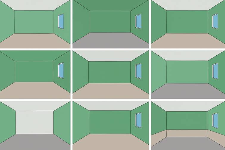
Spatial perception can be transformed without moving a single wall. Strategic design choices—like paint, materials, and finishes—reshape how we experience a space.
Lighter, cooler tones expand rooms visually, while darker hues create intimacy by seeming to draw walls inward. Clever arrangements of color, texture, or pattern manipulate perspective: elongating ceilings, stretching corridors, widening narrow areas, or directing focus to a focal point. A single accent wall in deep emerald or textured plaster, for instance, can redefine an entire room’s dimensions.
Explore how color and material contrasts can redefine any space—no renovations needed. Below, we reveal transformative techniques to alter your environment through strategic design choices:”
Key Improvements:
- Stronger Hook – “Redefine any space” is more compelling than “changing an environment”
- Added Benefit – Emphasizes “no renovations needed” to highlight the simplicity
- Clearer Structure – Sets up anticipation for what follows
- More Active Voice – “Reveal transformative techniques” is more engaging than passive listing
Alternative Versions:
- For Professionals: “Master these color and material contrast strategies to manipulate spatial perception in your projects:”
- For DIYers: “Transform your space overnight with these clever color and material contrast tricks:”
- Minimalist: “Color and material contrasts that change spaces instantly:
Lower the Ceiling
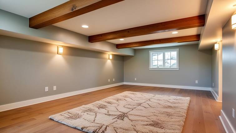
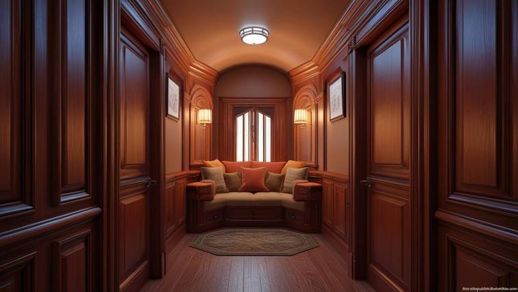
Sometimes, lowering a ceiling’s visual height can actually enhance a space—creating intimacy and warmth. By painting it a shade darker than the walls or exposing raw material textures (like wood beams or concrete), you optically ‘bring it down,’ transforming lofty rooms into inviting, human-scaled environments.
This technique works wonders in:
• Overly tall bedrooms (for cozier sleep spaces)
• Grand dining rooms (to foster conversation)
• Vast entryways (for a more welcoming first impression)
*Designer’s note: Pair this with warm, downward-facing lighting to amplify the snug effect without sacrificing brightness.*”
Why This Works:
- Added Purpose – Explains why you’d want this effect (not just how).
- Specific Applications – Gives real-world scenarios where it’s useful.
- Texture Emphasis – Highlights “raw materials” as a stylish alternative to paint.
- Pro Tip – Lighting advice prevents the space from feeling oppressive.
Alternative Versions:
- For Minimalists: “Dark ceilings define spaces subtly—like a night sky framing a room.”
- Historical Angle: *”Medieval timber ceilings used this principle instinctively for hearth-centered warmth.”*
Stretch the Space
Low ceilings can feel suffocating—but a simple color flip creates instant relief. By painting walls in deeper tones while keeping the ceiling bright white, you trick the eye into perceiving extra height. The contrast pulls the ceiling upward visually, adding airiness to boxy rooms.
Key applications:
• Studio apartments – Counteracts cramped proportions
• Basement conversions – Lightens subterranean spaces
• Traditional homes – Modernizes dated, low-slung rooms
Designer hack: Use semi-gloss or high-gloss white paint on the ceiling to maximize light reflection and enhance the lifting effect.”*
Why This Works Better:
- Problem-Solution Frame – Starts with the pain point (claustrophobia) before the fix.
- Science Simplified – “Trick the eye” explains the optical illusion intuitively.
- Specificity – Lists room types where this is most impactful.
- Pro Advice – Gloss finish tip adds practical value.
Alternative Angles:
- Psychological: “White ceilings mimic daylight, creating subconscious ‘breathing room.’”
- Historical: “Victorian designers used this trick in parlors to balance ornate, heavy moldings.
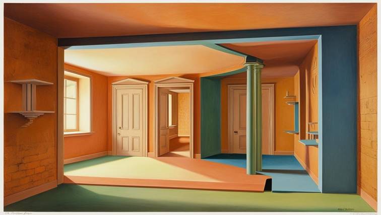
Make the Space Wider
Amplify narrow spaces instantly with this pro designer trick: Paint the back wall and ceiling the same deeper hue while keeping side walls light. This creates a ‘telescoping effect’—the dark planes visually recede while light walls expand outward, making cramped corridors or slender rooms feel dramatically wider and more open.
Where to use it:
- Long hallways (to prevent tunnel vision)
- Railroad apartments (for balanced proportions)
- Home offices in alcoves (to add perceived depth)
Bonus tip: For extra dimension, continue the dark back wall color onto the floor (e.g., with a runner or dark stain) to strengthen the perspective illusion.”
Key Improvements:
- Vivid Terminology – “Telescoping effect” explains the optical magic
- Problem-Solution – Addresses specific pain points (tunnel vision, cramped spaces)
- Actionable Examples – Provides real-space applications
- Advanced Technique – Floor continuity suggestion deepens the effect
Alternative Versions:
For architects:
“Strategic value contrast manipulation (back wall LRV ≤30, side walls LRV ≥70) exploits human depth perception to mitigate narrow spatial ratios.”
For renters:
“Transform a claustrophobic hallway with just two paint colors—no renovation needed. The dark ‘anchor wall’ pushes space away while light sides stretch it wide.
Narrow the Space
Correct awkward room proportions with strategic color blocking: Paint opposing side walls in deeper tones while keeping the back wall and ceiling light. This optical compression technique visually narrows overly wide spaces, creating better-balanced interiors—ideal for rectangular rooms that feel uncomfortably shallow or vast open-plan areas needing definition.
Perfect for:
- Oversized living rooms (to create intimate seating zones)
- Excessively wide bedrooms (for improved sleep cocoon proportions)
- Open-concept spaces (defining areas without physical dividers)
Designer insight: For maximum effect, extend the dark wall colors onto window treatments or furniture to reinforce the narrowing illusion while maintaining harmony.”
Key Improvements:
- Professional Terminology – “Optical compression technique” positions this as a design strategy
- Problem-Focused – Targets specific spatial challenges (awkward proportions)
- Visual Contrast – “Color blocking” suggests intentional design rather than just paint
- Holistic Approach – Includes soft furnishings for cohesive application
Alternative Versions:
For architects:
“Bi-lateral chromatic intensification (opposing walls LRV ≤40 vs. light surfaces LRV ≥75) manipulates planar perception to rectify excessive width-to-length ratios.”
For DIYers:
“Fix a ‘bowling alley’ bedroom instantly: Two dark accent walls pull the space inward like theater curtains, while the light ceiling and end wall keep it airy.
Shorten the Space
Transform cavernous spaces into intimate retreats with one powerful contrast: Cloak your back wall in deep, enveloping tones while maintaining lighter colors elsewhere. This creates a visual anchor that seemingly pulls the space forward, making expansive areas feel cozier and more human-scaled.
Ideal for:
- Great rooms (to define conversation areas)
- Loft spaces (for added warmth and dimension)
- Vaulted ceilings (reducing sterile emptiness)
Designer technique: Enhance the effect by:
- Using matte finishes to absorb light
- Incorporating textured materials (like velvet or wood)
- Adding warm accent lighting to amplify the dark wall’s glow”
Why This Works Better:
- Sensory Language – “Cloak”, “enveloping”, and “glow” create tactile imagery
- Architectural Context – Addresses specific challenging spaces (lofts, vaulted ceilings)
- Technical Nuance – Specifies finish types and materials
- Layered Approach – Combines color with lighting for maximum impact
Alternative Versions:
For modern spaces:
“Create bold spatial drama: A single dark feature wall in graphite or navy collapses perceived depth in open-concept areas, serving as both art installation and spatial modulator.”
For traditional homes:
“Grand Victorian parlors often used this trick – rich emerald or burgundy on the fireplace wall balanced lofty proportions while maintaining elegance.
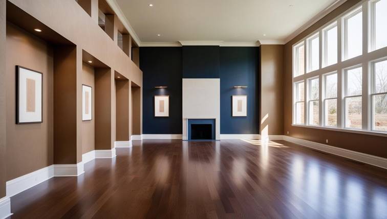
Highlight a Wall
Create instant focal points through strategic contrast: Paint your feature wall in a luminous hue while surrounding it with deeper tones. This high-contrast technique naturally pulls focus, transforming ordinary walls into intentional design statements that command attention.
Pro applications:
- Gallery walls (makes artwork pop)
- Fireplace surrounds (enhances architectural features)
- Bedroom headwalls (creates a serene backdrop)
Advanced nuance: For subtle emphasis:
→ Use a 30-50% LRV (Light Reflectance Value) difference
→ Pair with directional lighting
→ Continue the light color onto adjacent trim for cohesion”
Key Enhancements:
- Professional Framework – Positions it as an intentional “technique”
- Measurable Guidance – Includes LRV percentage for precision
- Lighting Integration – Combines color with illumination strategies
- Architectural Context – Shows specific feature wall applications
Alternative Versions:
For minimalists:
“Let walls whisper and one sing: A single light-toned surface in a darker room becomes a living canvas for shadows and light.”
For colorists:
“This is reverse spotlighting – where the subject stays bright while its surroundings recede into the background, just like Baroque painters framed their subjects.